These are several pieces designed for International Delight, from designing new flavors, preproduction for photography, ads, DRC for Sam’s Club and Costco and more.
While working for Danone NA, I was part of the small team that rebranded Danimals. My responsibilities included creating a new story for the brand, casting the illustrator, creating competitive landscapes and semiotic research, and design.
These are some of the images for Light & Fit’s brand world and some concepts created for the SKYR sub-line.
This is a sub-line brand adaptation for Silk’s Oat Creamer. Meant to follow its original line of creamer while allowing “Oat” to stand out and communicate a different source of creamer.
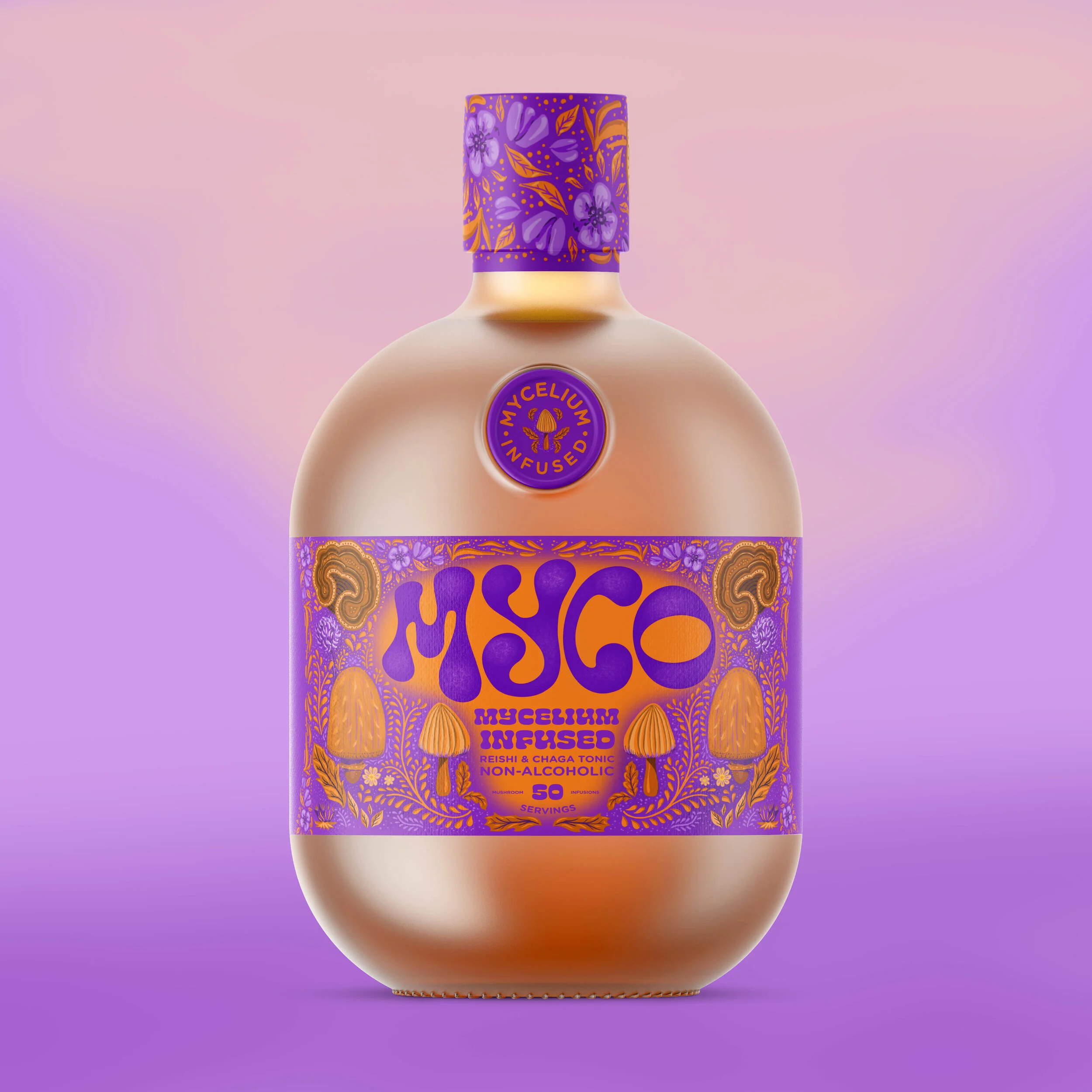
Since mocktails are usually referred to "as potions", we wanted to bring that to life in a more literal way, not only through branding but also through ingredients and the shape of the bottle. We like the concept of a mocktail that not only does not have alcohol but it has health benefits instead.
Kata Modo is a line of DIY sushi and sashimi kits. The kits aim to simplify the process of creating sushi while the packaging reinforces this notion by including easy-to-follow instructions. We teamed up with Nucleus Maximus to create this simple, yet powerful branding.
Inspired in fish textures and patterns, and Japanese obsessive perfection when it comes to sushi making, each SKU features a texture that represents what's inside, and all the information goes organized in the black faux label on top, that also suggests a sheet of nori.
With super bright colors and a unique palette we wanted to reach an audience that is more adult than their classic cookie dough. With a witty and indulgent feeling and a hint of vintage in order to stay aligned with the rest of the brand.
With the back and bottom panels we wanted to create a level of surprise while featuring cute illustrations of what the product looks like, the mouth in the back panel illustrate EatPastry’s actual co-owner’s mouth holding the product between her teeth.
With a modern and approachable feel, we wanted these cookies to stand out by adding an element of surprise. We came up with the idea of metallic combined with soft touch, which creates an interesting effect (sometimes it shines, sometimes is not even there) depending on the perspective.
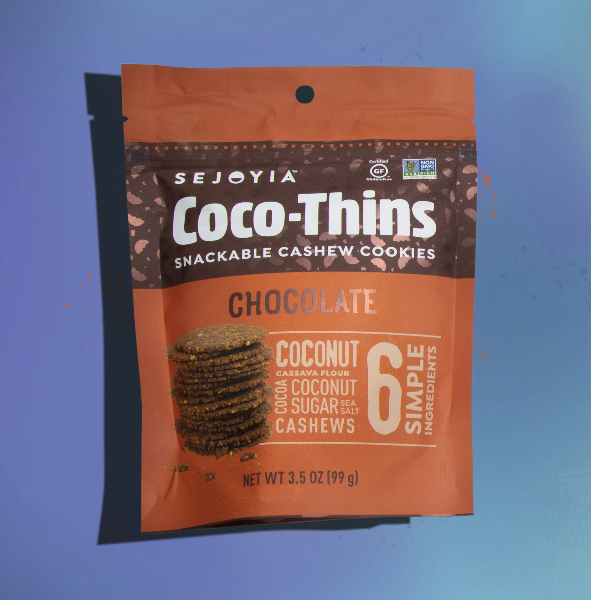
Coco-Thins' biggest value is the number of ingredients they have (7 or less) so we wanted the packaging to be as straightforward as possible, calling out the number of ingredients and the list of them in the front panel. Communicating this way not only what's inside of them but also that it is an honest company with absolutely nothing to hide.
The concept behind this impactful bags is to inspire the feeling of road trip snacking. American vintage postcards references reminds us of a more simple life. Simple and old as popcorn can be.
Manifesto by Evan Fry:
"To help make the miles more memorable. And tasty. So whether you’re going for a quick jaunt or a long haul, take our advice and take a minute to stop and grab a snack. And wherever you’re headed, yummy trails to you."
Reveri teamed up with Freelo to come up with branding for this one-of-a-kind frozen dessert packaging. This revolutionary dessert is made out of veggies and fruits. Yes, veggies as in spinach and peas.
Their unique ingredients are hero so we created patterns to represent each flavor. Organized in a nice looking grid, we created a specific area at the bottom section for all their great benefits. The top and the bottom of the packaging are deeply connected (top ingredients, bottom their benefits), creating an interesting balance and visual contrast.
Bright color and monster mouths? we knew it was going to make these cookies shine on shelf! The brand needed to better communicate what they are all about: vegan, happy, delicious and genuine. Instead of showing the monsters, we preferred showing only their mouths, suggesting there’s so much more to discover…
Inspired by their previous branding's website, the concept of a cookie monster helped bringing the branding full circle. The challenge was to design something appealing to kids and also moms, since in the end they are the decision makers.
After only 12 months on shelf, sales grew about 20%.
This creamy probiotic yogurt is fun and flowy creating a very recognizable and unique style that would stand out while fitting in.
We wanted this almond beverage to standout by contrast and to feel more special and organic than the rest in the category.
Aiming to give these cookie bites a more delicious and indulgent appearance, we went with a nice and bright, soft-touch, metallic sheen that looks like nothing else in the category.
Moving away from a product window now showcasing the product in a new, more effective way, using some new and trendy, top-view, product photography. Which Freelo was also responsible for.
The new logo gives the brand a strong and confident personality. Ingredients create a fun pattern and yellow creates an original color block, also communicates which flavor is inside in a cute and original way.
National Chemicals Inc is a company that has been around for 74 years providing cleaning products for the food service industry that are compliant with the food safety requirements.
This strategic rebrand redefined not only their design system to make it easier to understand but also the way they communicate what the product function is in a faster way through the use of color coding system, copy and illustrations. Giving their packaging different levels of communication with the busy service worker in mind.
Illustrations by Kim Inman
These concepts were part of a line extension showing how the brand could expand its brand's assets for better differentiation and benefit communication while at the same time bringing the brand's personality to the front panels.