Coco-Roons
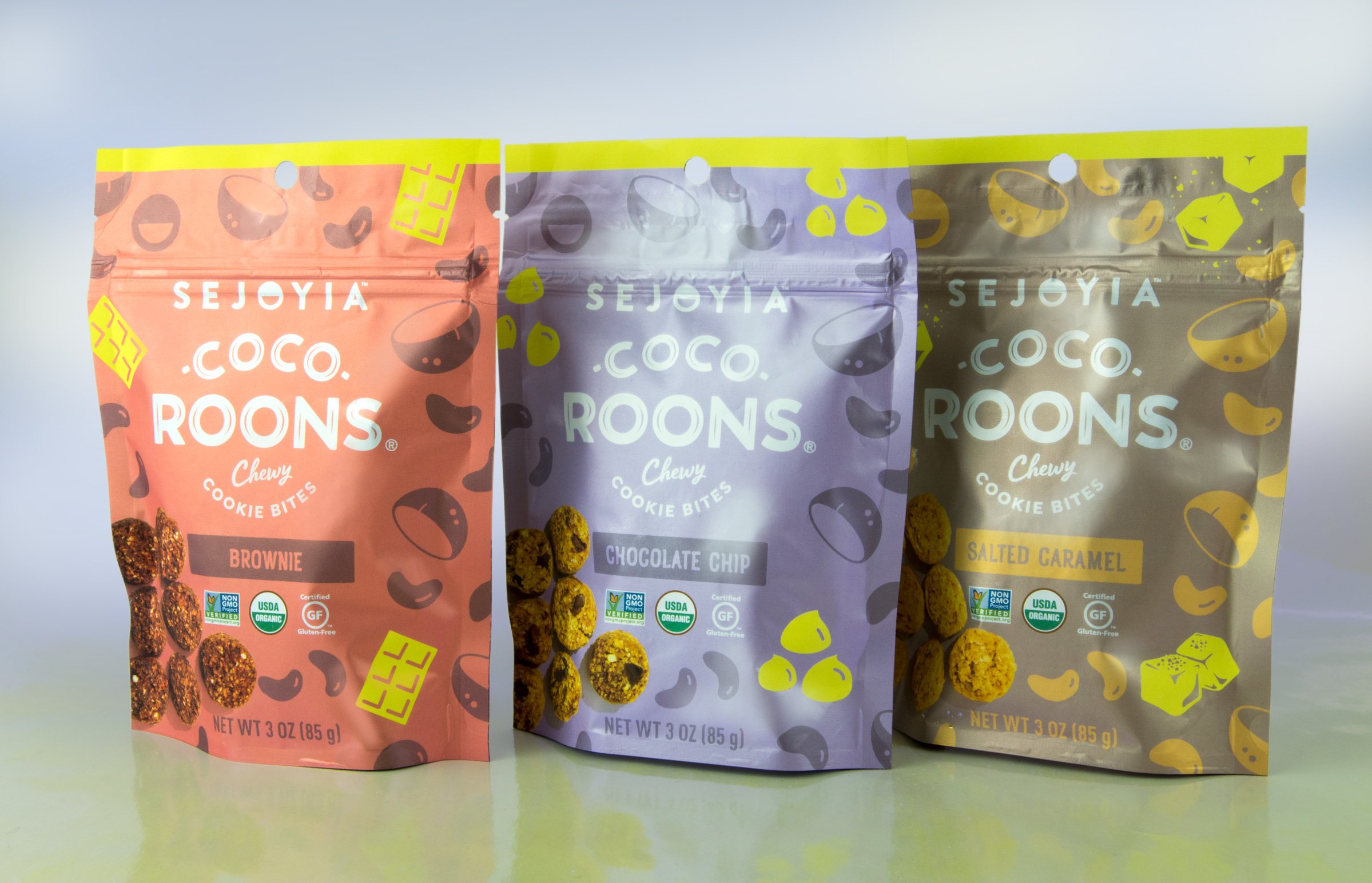
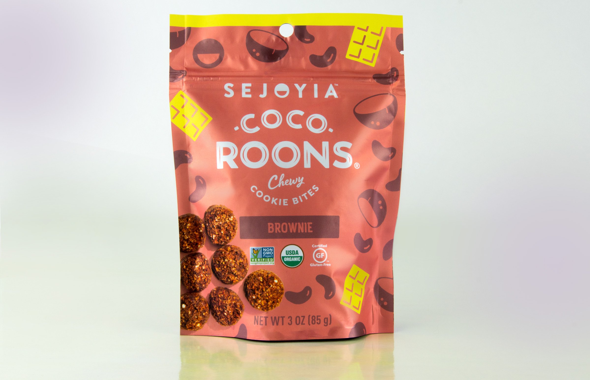
This rebrand for Coco-Roons highlights the simplicity of ingredients and indulgent nature of the product, aiming to position the brand as a standout leader in the snack category.
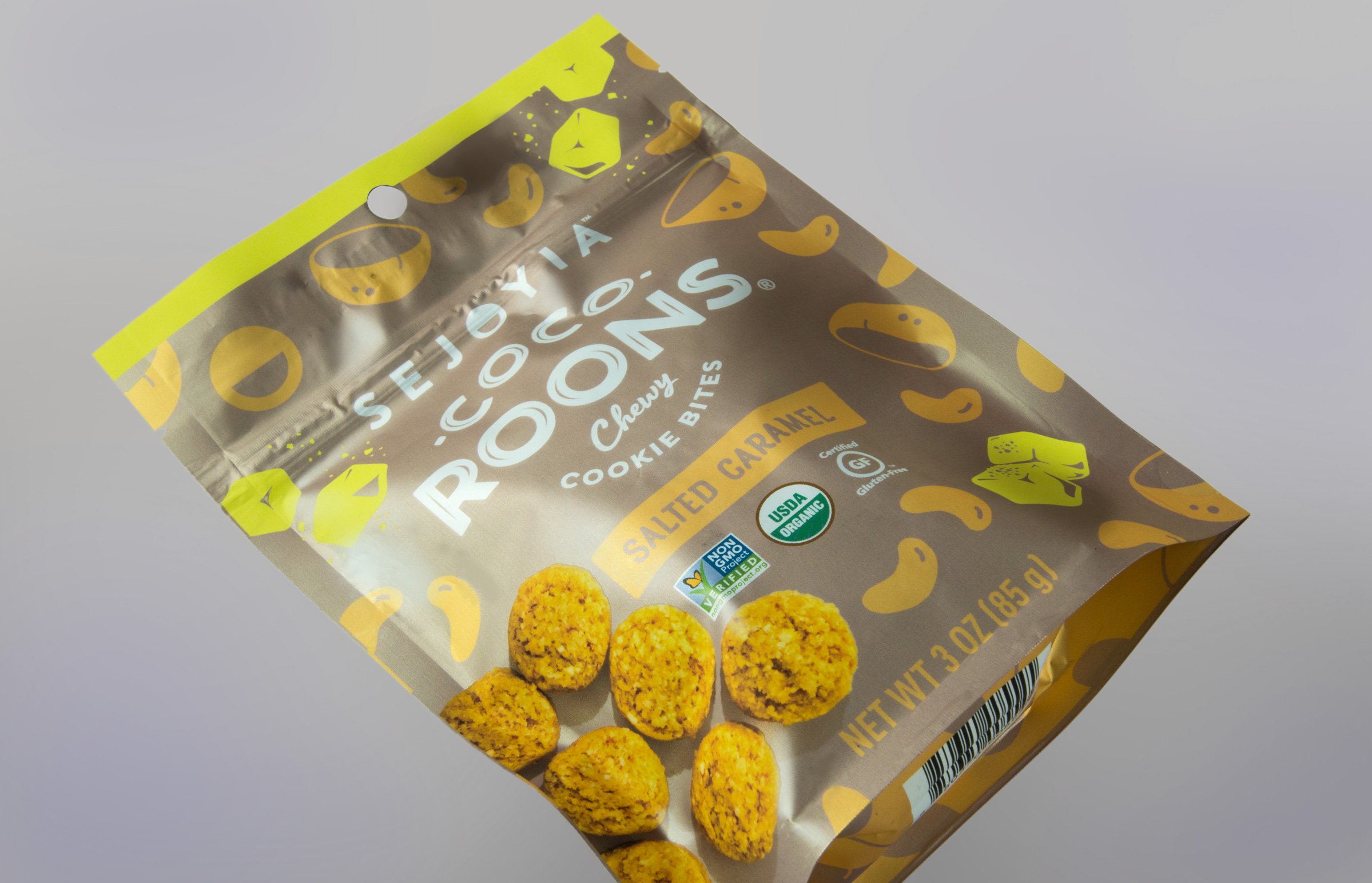
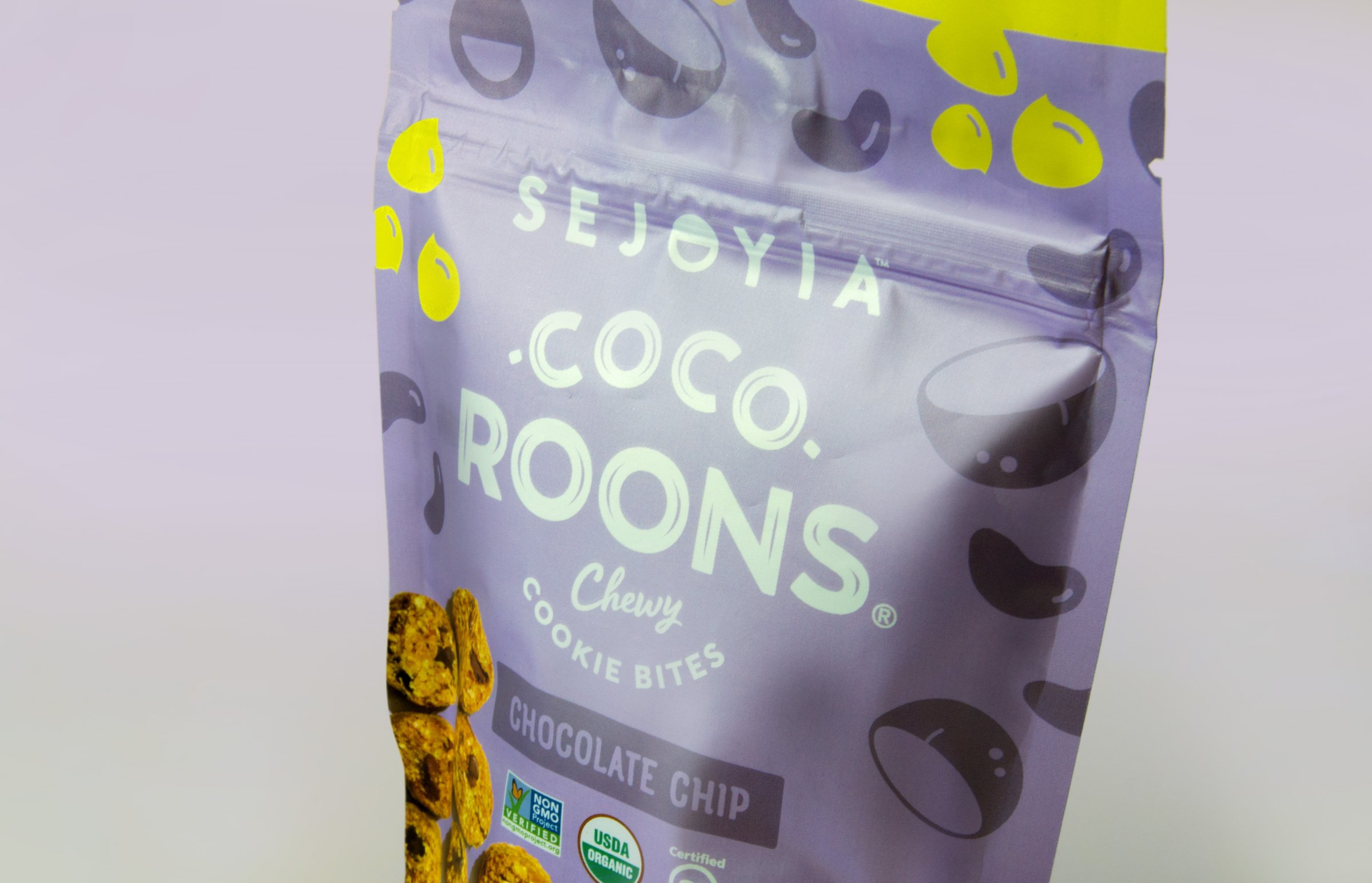
To give these cookie bites a more delicious and indulgent appearance, we chose a bright, soft-touch metallic sheen that brings out the indulgence of the product.
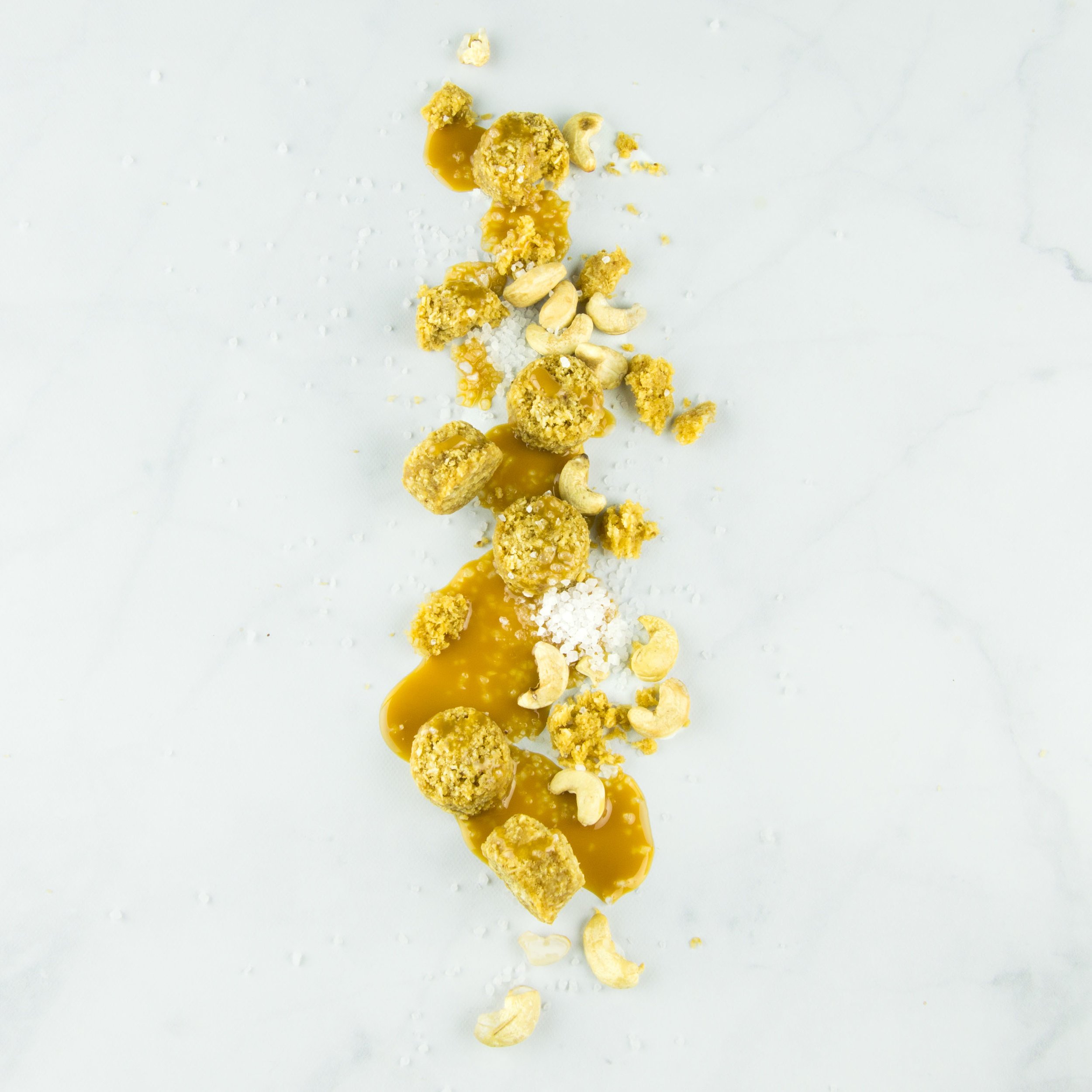
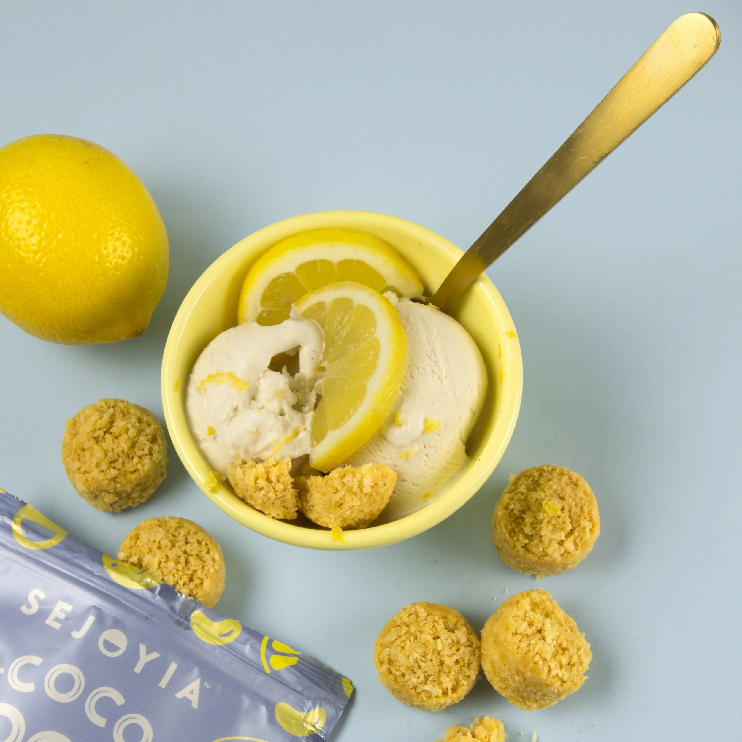
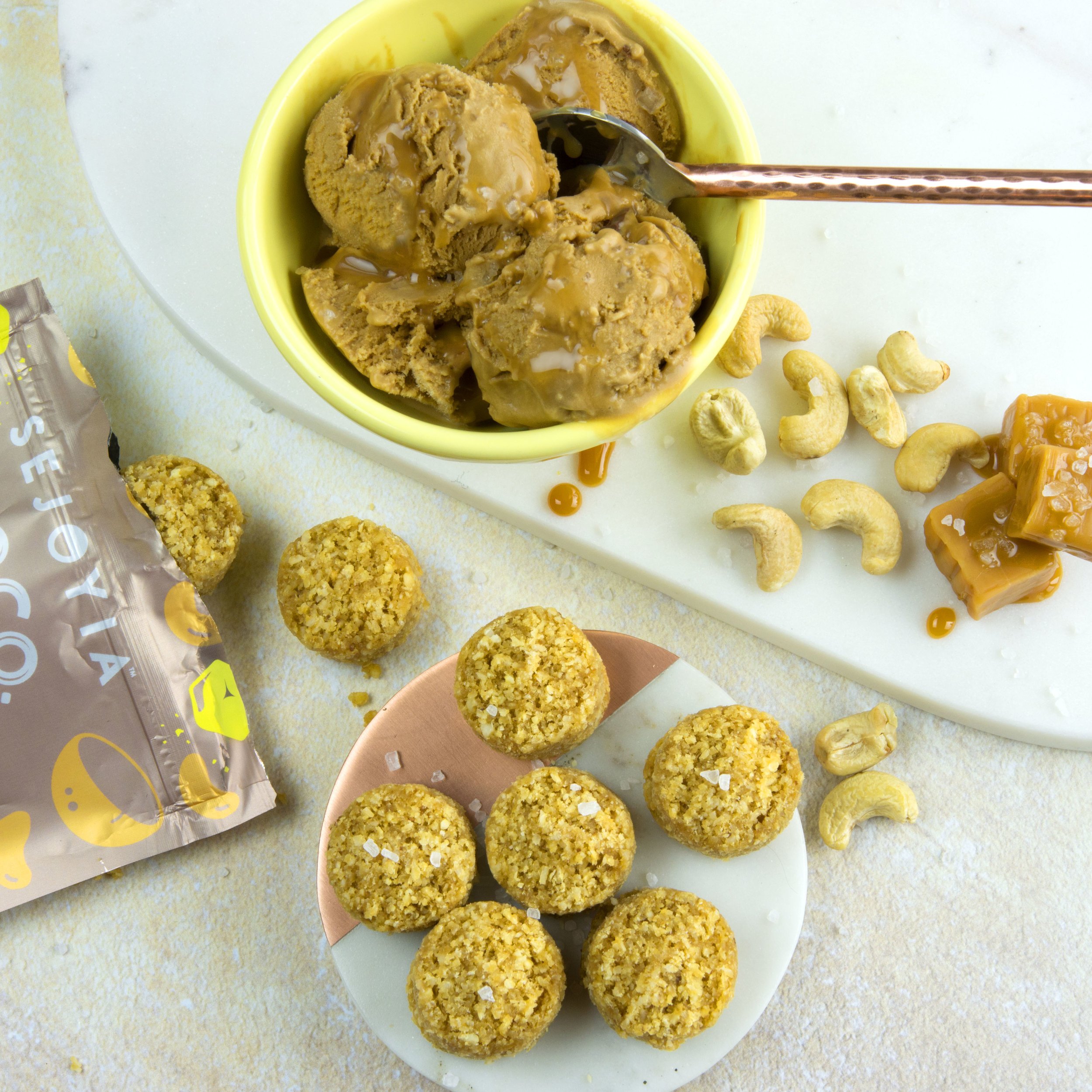
Instead of a traditional product window from previous design, we now showcase the product with trendy top-view photography, which we also developed at Freelo.
The new logo imparts a strong and confident personality to the brand. A fun ingredient pattern and a vibrant yellow color block not only add visual appeal but also clearly indicate the flavor inside in a charming and unique way.
