EatPastry Rebrand
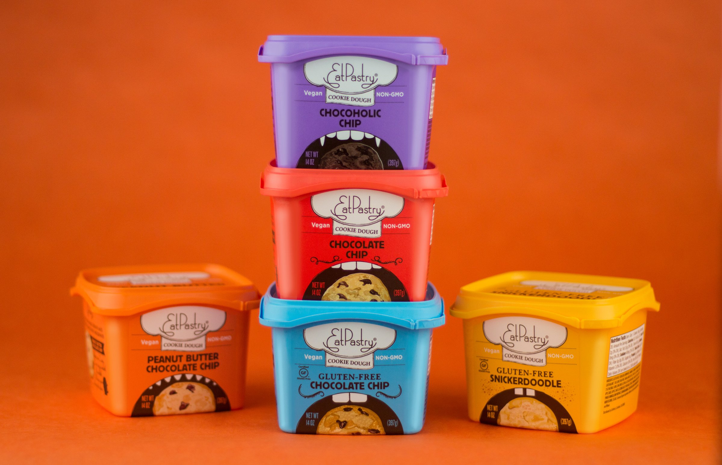
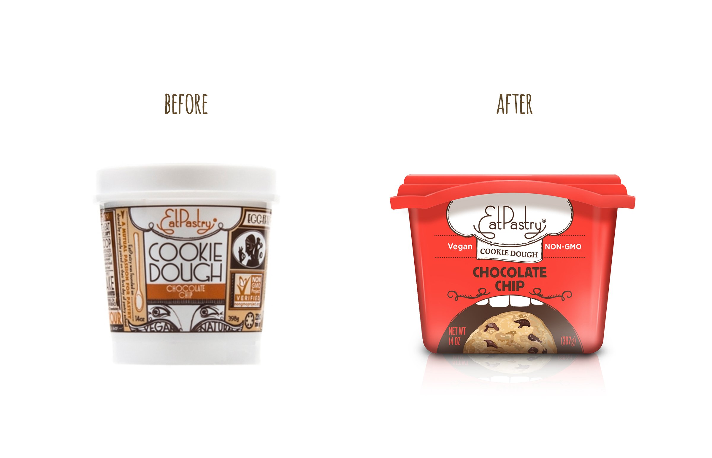
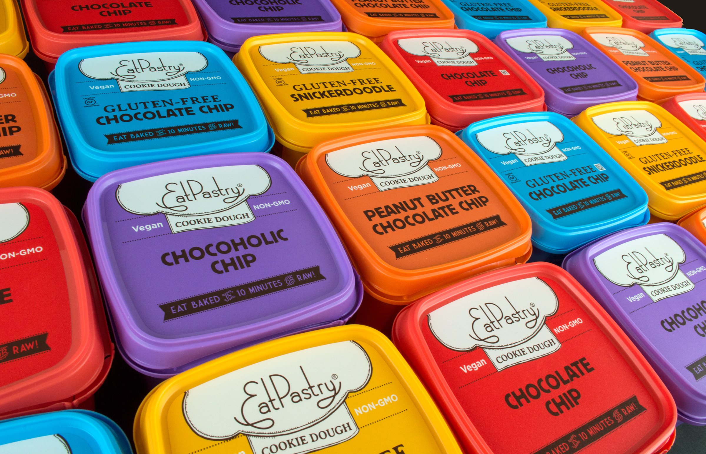
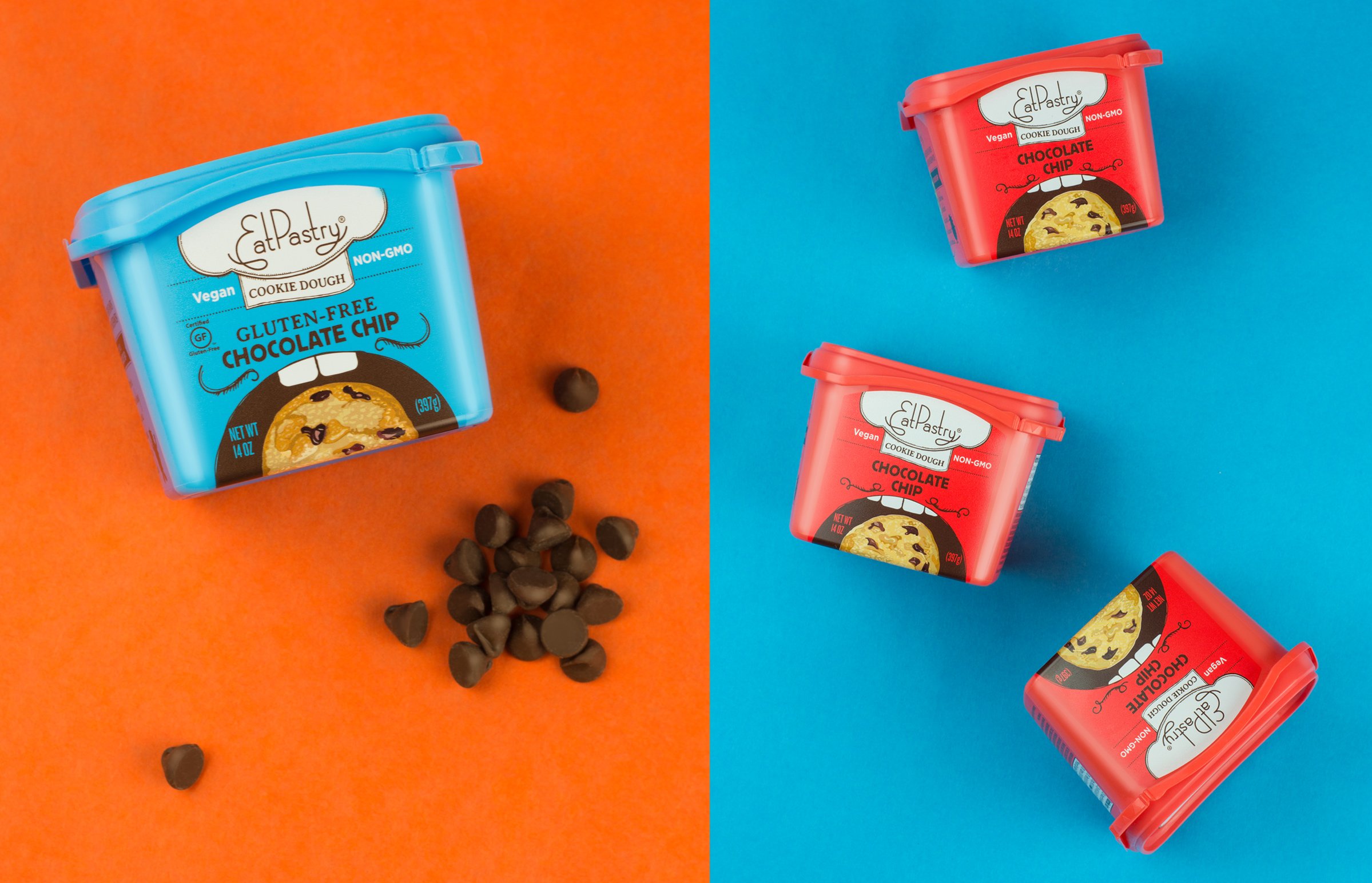
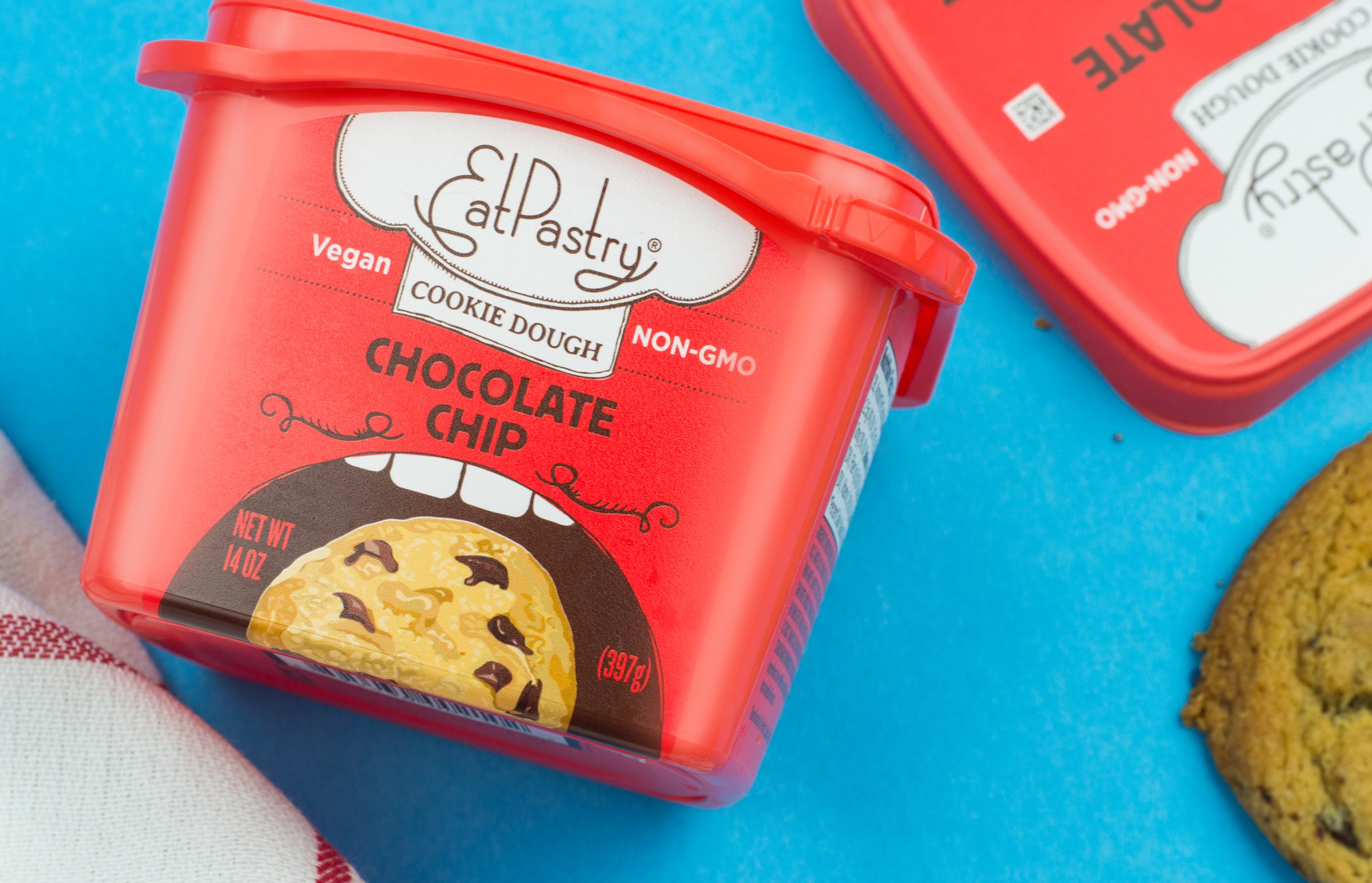
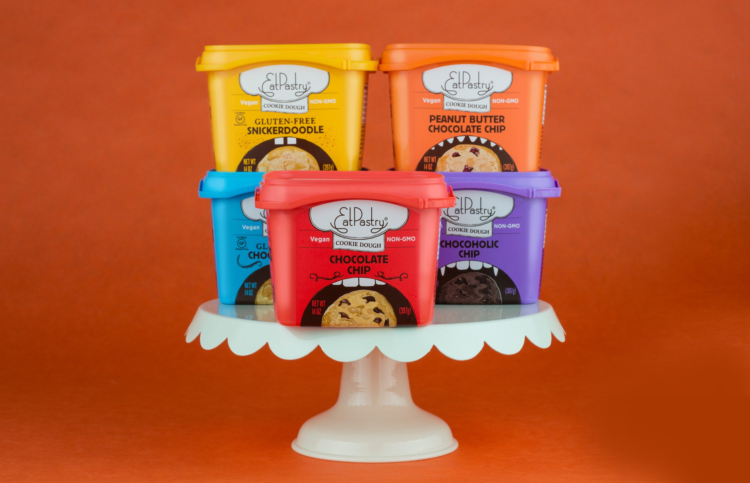
Conveying the brand’s values: vegan, happy, delicious, and genuine; these bright colors and playful monster mouths made these cookies shine on shelf.
Instead of showcasing the entire monsters, we focused on their mouths, hinting at the delightful mysteries yet to be discovered.
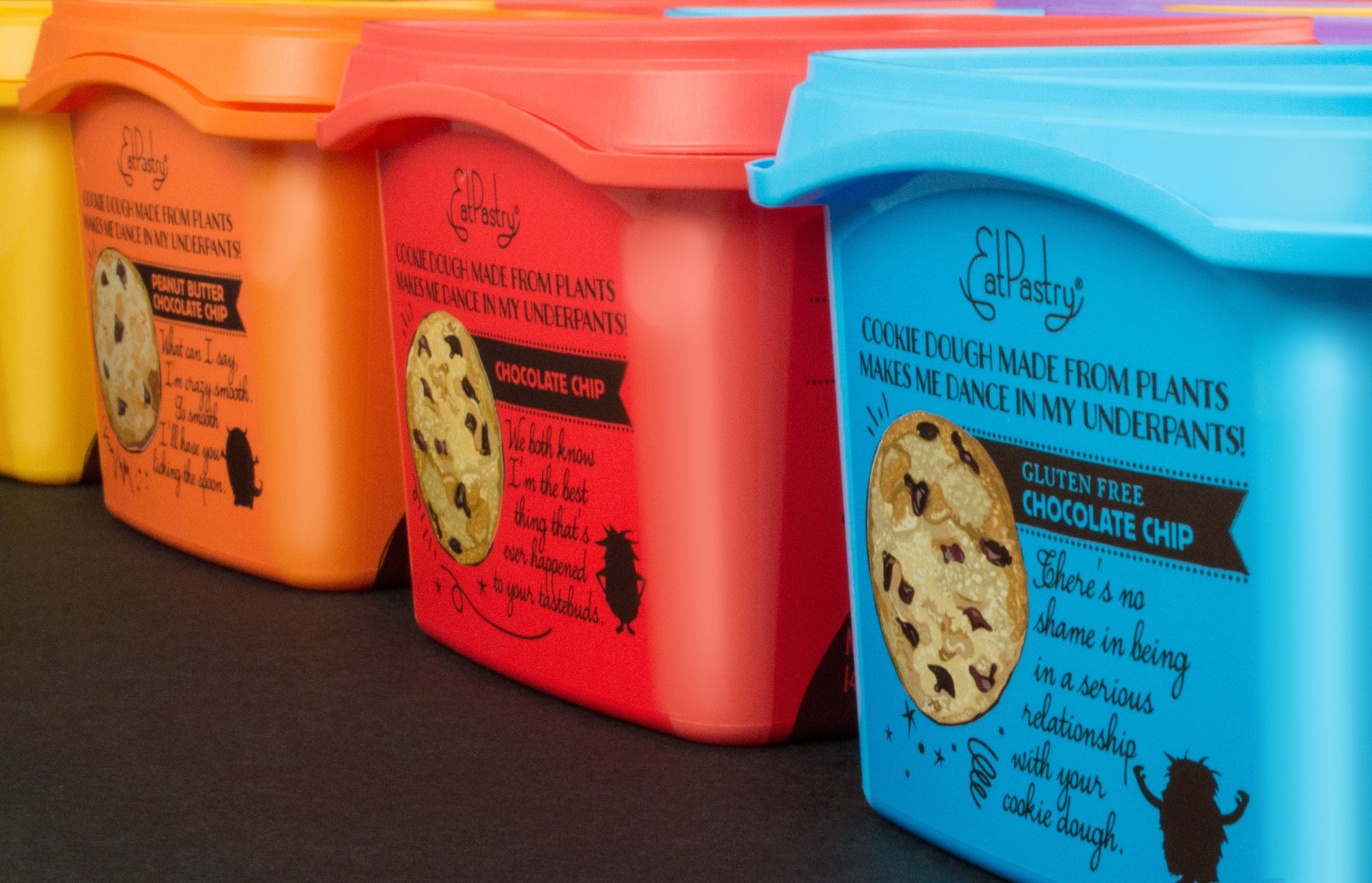
Inspired by their previous branding website, the cookie monster concept brought the branding full circle.
The challenge was to create a design appealing to both kids and moms, as the latter are the ultimate decision-makers.
This vibrant and engaging design strategy paid off, with sales increasing by 20% within just 12 months in 2013, and the iconic branding remained effective for the next decade.
